The end of 2021 was extremely eye-opening and disheartening for us, to say the least. After several months of dealing with unnecessary and unwarranted drama—and feeling like we were constantly fighting the current determined to push us out of Atlanta—we decided that the idea of leaving the city (that had turned toxic for us and no longer felt like home) wasn’t as heartbreaking as the catalyst that sparked the unwelcome and dark feeling that now surrounded us.
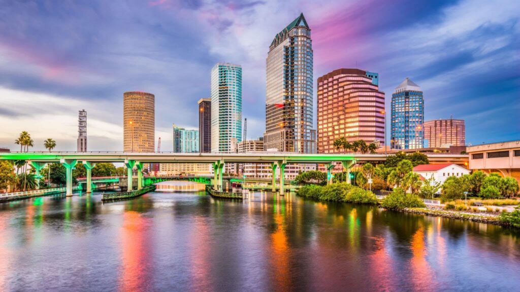
We set our eyes on the beautiful Tampa Bay area (which not only includes Tampa, but other cities such as St. Petersburg, Gulfport, Clearwater, and Bradenton, to name a few) and spent from February until May going back and forth between Atlanta and Tampa/St. Petersburg getting to know the community and areas, making new friends, and discovering what would become our new home.
We were getting quite frustrated with the home search, however, continually coming up empty as the time for our relocation drew closer.
After about our 7th trip visiting the area and checking out the market, we finally got approved for a place (which wasn’t available until July 20th) and despite our lease in Atlanta ending almost a full month before the start of the lease in Tampa, we were ecstatic.
We signed that lease without hesitation, knowing we’d figure out what we’d do during the gap between residencies, packed up all of our belongings (that survived the great purge), and haven’t looked back.
NEW LOGO
It took a while to get settled — much longer than originally anticipated — but now that we are, The House of Fuego is celebrating our relocation by announcing a new logo (shown to the left), new icon, new branding, and newly-designed website.
NEW ICON
Although we still plan on using the burning heart symbol from our previous logo throughout our marketing, we simplified our new icon: two Fs, stylized like flames, inverted and mirrored.